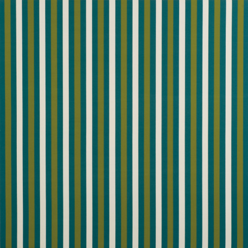
Julian Dashper [1960- 2009 New Zealand] Untitled 1991. Acrylic on canvas. Collection of the Dunedin Public Art Gallery.
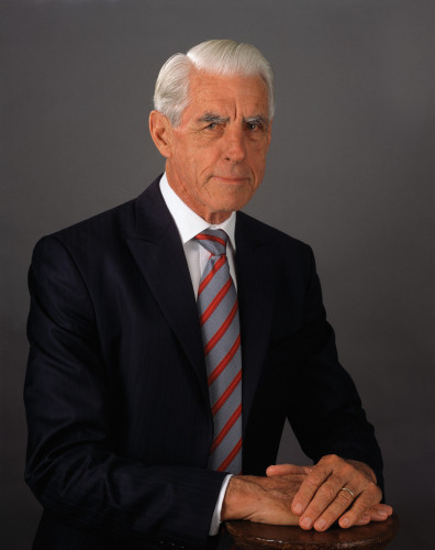
Yvonne Todd [b.1973 New Zealand] Founding CEO 2008. Inkjet print. Collection of the Dunedin Public Art Gallery.
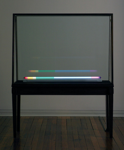
Spencer Finch [b.1962 American] Ice Cave Fox Glacier 2008. Neon tube and gel. Collection of the Dunedin Public Art Gallery. Gifted 2008 by the artist.
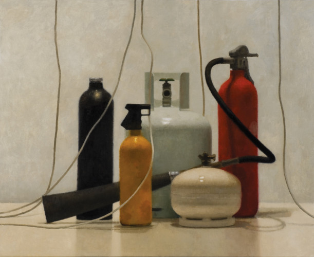
Jude Rae [b.1956 Australian] Still Life 205 2007. Oil on linen. Collection of the Dunedin Public Art Gallery.
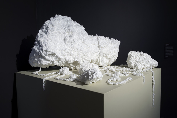
Peter Robinson [b.1965 New Zealand] Measure of disorder c.2007. Polystyrene. Collection of Jim Barr and Mary Barr
Kind of Blue
New acquisitions and loans
29 August 2009 - 6 December 2009
Kind of Blue brings together a selection of works that address aspects of absence, melancholy, loss and the discarded or disregarded bits and pieces from the everyday. This gathering of rather inconspicuous objects, images and performances pays homage to absent-minded thoughts, the repetition of seemingly pointless routines and the power of absurd gestures. From Martin Creed’s perfectly rolled up piece of A4 paper, assiduously constructed from a set of the artist’s instructions, to Campbell Patterson’s annual performances, which see the artist attempting to hold his mother aloft for as long as possible, there is something strangely disarming and seductive about these discrete items and activities.
In Ricky Swallow’s Forgotten Foundation there are echoes of these qualities as he honours those moments when you come across a surprising, even incongruous combination of elements that disrupt a normal everyday situation; finding a meat pack in the cleaning section at the supermarket, a damaged street sign that appropriately renames a site, or in this case a crushed can transformed into a pedestal for an apple core. On another level this sculpture is a perceptive play on the still life genre, here reduced to its logical conclusion as it bears all the marks of its consumption.
This sensibility is also located in the still life paintings that Jude Rae has been producing over the last decade. With Still Life 205, 2007, there is a compelling tension between the fastidious attention to the act of spectacle and the dryness of the subject matter. This artist’s analysis and deconstruction of painting is poignantly articulated in this work. She does not shy away from showing the bones of the work’s construction, while also celebrating painting’s ability to lapse between abstraction and realism.
The artists included in Kind of Blue find ways to capture poetic and ethereal qualities from the most humble of resources. This is beautifully illustrated in Spencer Finch’s Ice cave, Fox Glacier, 2008. Ice cave, Fox Glacier is a neon work that Finch created while he was undertaking the Dunedin Public Art Gallery’s Visiting Artists Programme in 2008. As part of his residency, the artist travelled to the West Coast of the South Island to experience, document and respond directly to the New Zealand landscape. As a prelude to the piece, Finch measured the exact colour and intensity of blue light that was refracted inside an ice cave on Fox Glacier. In Ice cave, Fox Glacier he breaks down the precise combination of colours that make up this original light recording - so through the simple act of wrapping coloured lighting gels around a fluorescent tube the artist is able to replicate and capture this exquisite moment for ever.
There is an unwavering and deliberate aspect to this artist’s methodology which clearly links all his projects. From the first creative impulse to the final resolution, there is a sustained consistency of vision. On another level, the work is a meditation on the slippage between the empirical act of recording the most intangible atmospheric qualities, and the artist’s assiduous attempt to remake or regain the lost moment.
Both Finch and Rae are interested in recording and describing common elements and elevating them from their concrete, prosaic situations. Their work is an invitation to slow us down, and through this, recognise that the process of looking is a deeply loaded and evocative activity.
In Juliette Blightman’s film At midnight, which is 1am, although it is midnight again, 2007, time is not only the subject of the work but also the measure for activating the projector, which in turn becomes an important part of the work’s materiality. Initiated at the beginning of the exhibition to coincide with midnight in London and designed to operate at thirteen-hour intervals, this film becomes as much about time’s displacement as it does about what appears on the screen. In this sense missing the screening becomes an important aspect of the piece, as the film continues to play when the Gallery is closed. Blightman’s interest in the examination of substance is also evident in the filmstrip’s gradual alteration over the duration of its display. She sees this change as an important addition, rather than degradation, of the work’s filmic quality.
In a similar sense, Julian Dashper’s series of paintings Untitled, 1991, operate like formal abstract decoys in that they knowingly mimic Modernism’s visual language, and in the process reveal the illusions embedded in this system. These paintings, which look the part, are designed to seduce you into a false sense of security because behind their seamless façade lie a number of nagging questions about the artist’s gamesmanship, originality and values. This is tough, uncompromising and engaging work that is simple at a surface level, but invariably complex once you start to go beyond an initial reading.
Art historian, Francis Pound, likened the vertical stripes that repeat through this series of paintings, to the pattern used on butcher’s awnings. If you are convinced by Pound’s assertion, then a logical next step, is to consider the artist’s appropriation and elevation of the butcher’s motif, as an interrogation on the relation between a pattern’s operation in an everyday realm and how it is read in a gallery context.
Even when a collection of protagonists such as these are brought together in this exhibition, it is difficult to discern what they represent or are contemplating as a group. They are only remarkable for their aloofness, absence and lack of character. The sense of disquiet that this generates is palpable in Yvonne Todd’s photograph The Founding CEO, 2008. The first image of a male to be produced by the artist, the project saw Todd combing through the portfolios of professional photographers who specialise in corporate portraiture, and subsequently mimicking their work. However, through her lens, the sitters take on another set of values as they become interchangeable as a type, and by extension, indistinguishable or even expendable. As the artist notes of the men in this series: ‘They are well-maintained physically, not balding or paunchy. They exude confidence, trust, paternal love, along with a steely, resolute authority.’
There is a distinct coolness to the works that make up Kind of Blue. They tend to operate at the minimal and cerebral end of the spectrum, rather than relying on sensational effects or ostentatious showmanship. While the arrival and acquisition of these artworks has occurred independent of each other, there are distinct concerns that these artist’s share and which have appealed to the curators, patrons and owners who have made them available to the Dunedin Public Art Gallery. Having said this, Kind of Bluedoes not aim to lock down the meaning of these individual pieces, but instead seeks to activate the artists’ ideas by providing enough room for their works to breathe and speak to one another.
Kind of Blue is dedicated to New Zealand artist Julian Dashper, who died 30 July 2009.
He made striking and provocative works of art, was a vocal champion for the cause of contemporary art, and was an important role model for a new generation of artists.